Thursday, May 5, 2016
Hero Post-Up/Down
During my Up/Down shoot I had visioned using the swing set however they weren't as interesting as I thought they would be. I ended up using the fireman's pole and the spinning ride. For both of these shots I laid on my back getting the shot from underneath my subject. The spinning ride was the most difficult, I had my shutter speed at 1/20 second and was trying hard not to move so I wouldn't get the subject blurry but still getting the background blurry. I had him run around with the contraption and then jump on, quickly getting the shot before he fell. They sky was in my favor, it was not too sunny to where I wouldn't be able to get the shot I wanted. In the end I couldn't decide which image I wanted to use for my hero post so I decided to use both.
Hero Post-Updated-Time
My initial idea for my Time post was going to be at the train station with people running to the train trying to catch it. I instead used the Santa Monica pier where there were more people around to create the motion that I wanted. I had my subject placed in the center of the pier with people walking around him. Because I couldn't use a tripod I had to position myself sitting down against a trash can to stabilize myself and camera. Another issue I had was people being too polite. I needed the people to walk around my subject but many people would stop and apologize for getting in the shot. Or some would go around. We had to wait for swarms of people to walk by to get what I needed. I took this image right after sunset. I had imagined more lights being on but they didn't turn on until late.
Before the edit
Because of the issue with many people trying to be polite I had to use to images and merge them together to create an image with a lot of people walking by.
Hero Post-Change
My thought for the Change project was to work around the bipolar disorder. The constant change between emotion at times can be uncontrollable. My original model was going to be a 46 year old woman who is bipolar but she had cancelled on me last minute. Thanks to Patricia and Juan I was still able to accomplish what I was looking for. I used two techniques with split lighting and the beauty dish. I wanted to use spilt lighting because it creates a strong moody image, darkening the sides to make it more dramatic for their neutral face. I kept the split lighting but added a reflector to make the image where they are smiling a bit brighter. The middle images were used with the beauty dish to show the detail of the running mascara and tears falling down the face.
Before the editing
Tuesday, April 19, 2016
Up/Down & Change
Up/Down
When I think of Up/Down a children's playground comes to mind. The swing was one of my favorite things when growing up, going super high as if going up into space and then crashing back down to earth. I plan on using multiple attractions at the playground and seeing which would work best to describe the feeling of the world spinning and turning. I plan on using a male model, growing up boys played more rough on the jungle gym and were more wiling to jump from the high places.
Change
Thursday, April 14, 2016
Culture
Hero Shot
Latin-American
My work emphasizes on the dual personality/culture my family has. We are Latinas but often get confused for different ethnicities because of our fair skin. My goal was to shoot the American styled photos as soft and subtle and the Latina side as bold and loud. During the shoot I was having trouble with the sun. We had to go during mid-day because of conflicting issues with my model. It was troublesome but I was able to get images I was happy with. I used my external flash to make sure my subject was properly lit all around and would help with the harsh shadows the sun was causing. During the photo shoot we heard a rattle snake approaching so we decided we would end it at that location. Professor Schafer helped me with the edits and I was able to play with the highlights and shadows to get the image where I wanted it. With the second image I kept going back and forth between making the image warmer or leaving it the way it looks like now. I ended leaving it a little bit cool, when making it warmer it made my subjects skin too red.
Before the editing
Thursday, April 7, 2016
Pre-Production: Culture
My goal is to take pictures of the mexican styled woman and a classic american woman. I'm using the same subject throughout my photos while only changing her clothes and hair styles. My goal is to show both sides of the Mexican-American woman side. My sister and I are always subject to this topic as sometimes people don't know we are spanish speaking-mexicans and will speak spanish trying to avoid us in conversation or say something rude not knowing we understand what they are saying. I plan on shooting my subject out in the hills for the mexican style photos and inside a home or room for the americanized style photos.
Tuesday, April 5, 2016
Direction & TIme
Direction
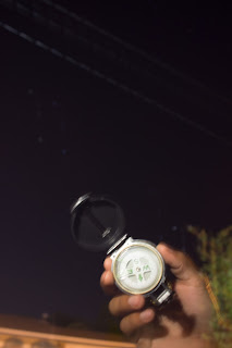
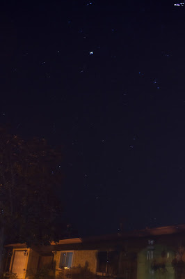
It was difficult to shoot this image as some of the lights outside were uncontrollable and made the image different than what I had in mind. The settings used were ISO 100, f5 and the shutter speed at 2 minutes and 43 seconds. While the shutter speed was still open I moved the camera up slowly, in order to get more of the sky in the image. I merged this image with one that I had taken of the compass. There is a saying that the north star will always help you find your way home. Although it was not my initial idea for direction, the saying mentioned above helped with the new approach.
Time
My initial goal for time was to have people around the train station, watching them move around as the train came closer and closer. Upon arriving at the train station it was lonely with only one person waiting. I decided to use this image because it depicted time as being wasted or forgotten. She had expected the train to arrive from what it said on their website however the kiosk mentioned another time she had to wait 2 hours for her train to arrive. I cropped the image and made it tighter to emphasize the empty train tracks.
Time Part 2
Unable to get the original image I wanted for the concept of time, I decided to try another approach, aging. Although it would take years to photograph 1 subject to show the passing of time I decided to shoot a family. I took a picture of each of my subjects and then merged them into one. The difficult process was finding the right way to place each subject. If I over lapped them, it would create a weird new person, if I left too much space it looked like an old 80s family photo. I liked using the approach with the three generations, it shows what to expect in the future.
It was difficult to shoot this image as some of the lights outside were uncontrollable and made the image different than what I had in mind. The settings used were ISO 100, f5 and the shutter speed at 2 minutes and 43 seconds. While the shutter speed was still open I moved the camera up slowly, in order to get more of the sky in the image. I merged this image with one that I had taken of the compass. There is a saying that the north star will always help you find your way home. Although it was not my initial idea for direction, the saying mentioned above helped with the new approach.


Time
My initial goal for time was to have people around the train station, watching them move around as the train came closer and closer. Upon arriving at the train station it was lonely with only one person waiting. I decided to use this image because it depicted time as being wasted or forgotten. She had expected the train to arrive from what it said on their website however the kiosk mentioned another time she had to wait 2 hours for her train to arrive. I cropped the image and made it tighter to emphasize the empty train tracks.
Time Part 2
Unable to get the original image I wanted for the concept of time, I decided to try another approach, aging. Although it would take years to photograph 1 subject to show the passing of time I decided to shoot a family. I took a picture of each of my subjects and then merged them into one. The difficult process was finding the right way to place each subject. If I over lapped them, it would create a weird new person, if I left too much space it looked like an old 80s family photo. I liked using the approach with the three generations, it shows what to expect in the future.
Thursday, March 10, 2016
Pre Production-Direction & Time
Time
My initial idea for the Distance is to go to the train station down in Moorpark. When I first arrived to CSUN, I had no car and had to commute from Moorpark to school. It was the first time I had ridden the train and it was a little nerve racking as I was not use to it. Transportation is one of the closest things to distance as it is the object that gets you from point A to point B, watching the people move around, frantically. The movement of the subjects and the train shows how time moves. I plan on shooting a similar image like this but with more people surrounding the area, the more people the better. I want the movement of both the train and the people to show. I would take the images before sunrise and a bit after sunrise.
Direction
My idea for time is to do a time lapse like the one presented above. This one seems too obvious for me to do, my niche is abstract so I plan on completing this to the best of my skill. I plan on doing a grid however instead of one single spot, I plan to take photos of different town signs. I will make my own sign that reads "Almost There" and place it next to each of the city posts. Each of the pictures will have this feeling of never getting to the destination.
Tuesday, March 8, 2016
Music-Hero Post
This is my favorite of the many shots I took for my Music session. I cropped the image and used the rule of thirds to leave negative space. As mentioned before I love the black and white look to images, adding a sense of mystery to them. I used a chrome microphone because I figured it would have a nice effect with the black and white and would be more noticeable with the way I was arranging my lights. In this "portrait', I used only one light, it was a hair light. I experimented this particular pose with both the hair light and a beauty dish, however the effect I was looking for was better accomplished with just he hair light.
Before the editing and magic happened. It was a back and forth decision of how exactly I wanted to edit the image. Whether to leave it as is, to crop or not crop. Color or black and white.
The images selected below are just a few more that I loved. It was a hard choice to choose the one that would represent my favorite. Both my models were easy to interact with and
went with the flow, I made sure they were relaxed and had fun that way the pictures would come out "natural" than forcibly posed . We used movement for some shots, trying to get into the groove of music and follow the sense of feeling a song can have. I kept changing the position of the lights and turning them on and off to see which effect I would like better. Some had both, some either just the hair light or beauty dish. The last image shown, (the one with the bubble gum) was a technique Professor Schafer showed me. It was done by setting my ISO to 1600, f4, and shutter speed of 1/125. Instead of using the alien bees, I used only the light inside the room. We used white boards above the subjects and to their right side to bounce of the light. A white backdrop was placed behind and we used the black part of the v-flat to even out the light.
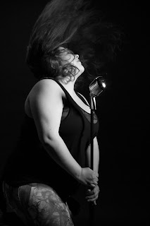
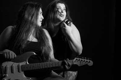
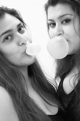
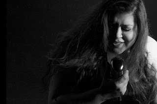
These are both of the set up shots for images presented.
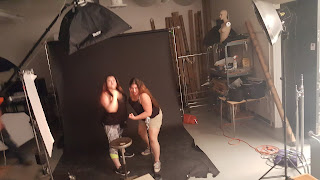
Tuesday, February 23, 2016
MUSIC Ideas
When people hear of music they gain different aspects of every emotion possible. Happiness, Sadness, Anger, Frustration, Understanding, etc. When I listen to my music I gain a perspective of understanding of the world and how dramatic it actually can be. The images presented below show the work of simple instruments and a great work of detail with minimal information. I saw the image of the girl with the headphones in class and decided to look further for images like this. I thought it was a cool technique.
I plan on using an electric guitar and a retro style microphone with its stand. I'm still debating on whether I want to keep the effect of the black and white or have the color of the guitar or microphone show in the last hero post. I love black and white photography so I might end up leaning towards that effect towards the end.
I plan on attempting this type of lighting by using a black seamless. Having my subject about 5 feet away from the backdrop, fill lights on the each side but closer to the backdrop and a hair light above the subject. Depending on how the fill lights are effecting the image, I will also try with just the hair light and see what type of effect that does.
Thursday, February 18, 2016
My Hero Shot!
Using the depth of field either great or shallow, allows the subject to either become distorted and abstract. Uta Barth is my inspiration. Her ability to create wonderful images with light and motion are a great way to witness the world. I wanted to create more of blur with the blinds above as the images before. As much as I tried to move forward towards the camera I would loose the light that I needed. Self portraits are not my forte however it was okay to shoot. My original image was in color and a bit more dull. I brightened the image and added contrast to get rid of the background behind the blinds. Making my face into a silhouette was on purpose, again I like to work behind the idea of abstraction and the unknowing.
Using the depth of field either great or shallow, allows the subject to either become distorted and abstract. Uta Barth is my inspiration. Her ability to create wonderful images with light and motion are a great way to witness the world. I wanted to create more of blur with the blinds above as the images before. As much as I tried to move forward towards the camera I would loose the light that I needed. Self portraits are not my forte however it was okay to shoot. My original image was in color and a bit more dull. I brightened the image and added contrast to get rid of the background behind the blinds. Making my face into a silhouette was on purpose, again I like to work behind the idea of abstraction and the unknowing.
Thursday, February 4, 2016
My work begins with an approach and emphasis on abstraction and disorientation to provide a means of escape from the tangible world. I emphasize selective focus and start the edges of the frame within ordinary scenes to cultivate a sense of mystery. My ambition is to broaden my creativity and see the world from a different perspective through the eye of the lens. Making my images black and white adds a sense of mystery to the photos, making a less tangible object in the world.
My work begins with an approach and emphasis on abstraction and disorientation to provide a means of escape from the tangible world. I emphasize selective focus and start the edges of the frame within ordinary scenes to cultivate a sense of mystery. My ambition is to broaden my creativity and see the world from a different perspective through the eye of the lens.
Subscribe to:
Comments (Atom)


